Redesign of Photography Website
Personal Project
Aino Vuokola Photography Website Redesign
Project Overview
As a photographer, I noticed that my website ainovuokola.com was not serving its visitors as well as it could. The site had a clear separation between business and private clients, but private clients were all directed to a single Portrait Photography page regardless of whether they were an expecting mother, a family, a couple or a graduating young adult. With all portrait themes grouped together on one page, the content did not speak directly to any specific visitor. Practical information was missing, and without clear pricing, session details or a straightforward path to the contact form, the site was not effectively encouraging visitors to take the next step and make a booking.
This self-initiated redesign aimed to address these issues by restructuring the site's navigation and information architecture, developing clearer and more informative service pages, and improving the overall user flow. The project covered UX analysis, user group mapping, sitemap redesign, content development and implementation in Squarespace.
The changes were made both in desktop and mobile versions. Here I will present only the desktop version.
Tools Used
FigJam – Primary workspace for collecting and organising all design process documentation, including screenshots of the current site, user group analysis and sitemaps.
Claude – AI-assisted ideation and content structuring throughout the design process.
Squarespace – Implementation of all structural and content changes to the live website.
Website
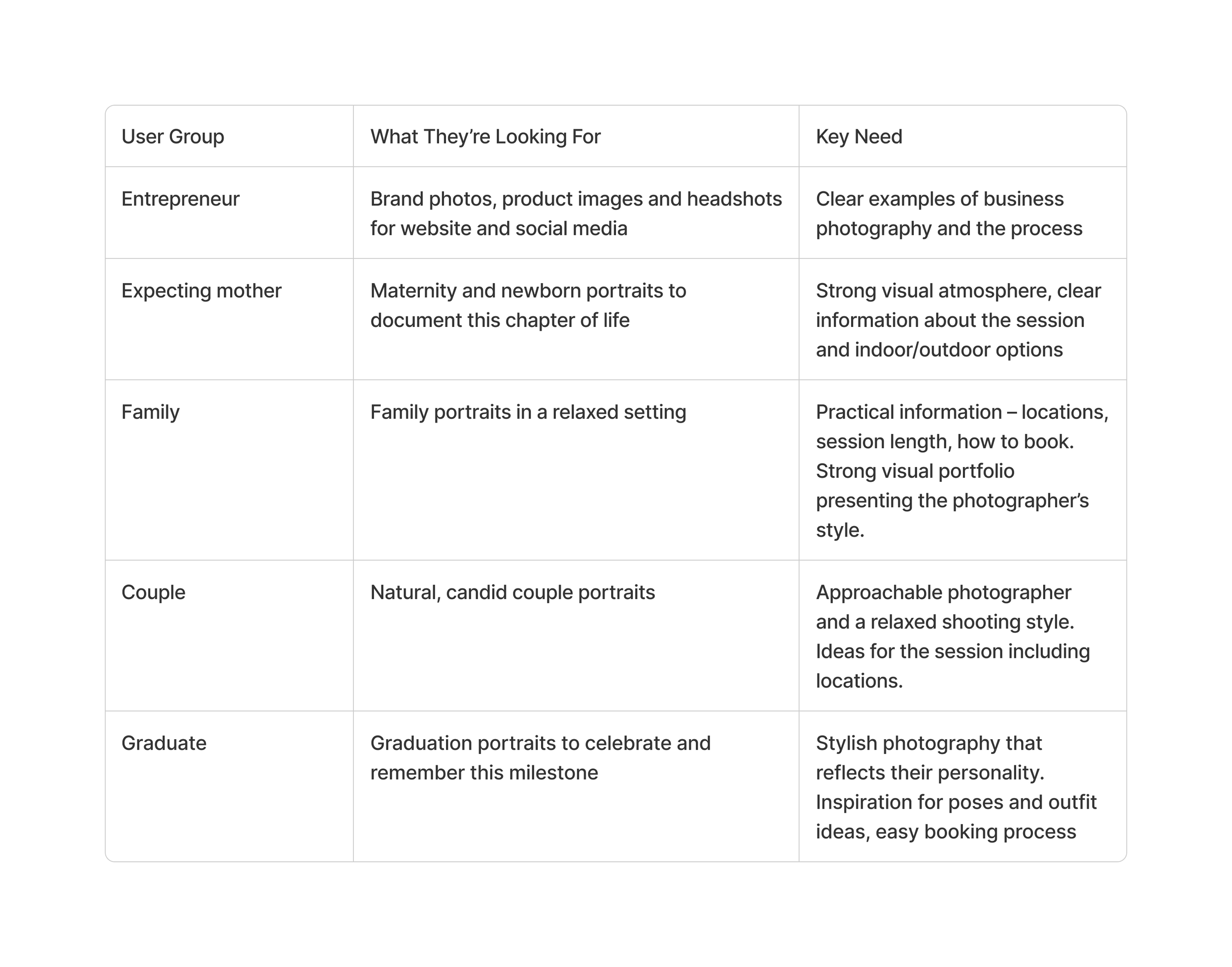
I started the process by identifying the main user groups. Entrepreneurs represent business clients, while private clients were divided into four different groups: expecting mothers, families, couples, and graduates.
User Groups
Problem Statement
The website serves two distinct user groups – business clients and private clients – each with different needs and intentions. Private clients are further divided into several subcategories: families, expecting mothers, couples, and graduates. The current homepage reflects this division by presenting business photography and portrait photography as two equally weighted sections. However, while business clients are directed to their own dedicated content, all private clients – regardless of their specific needs – are funnelled into a single Portrait Photography page.
This means a private client looking for, for example, maternity photography must first scroll past content that is not relevant to them. The Portrait Photography page displays a large variety of images from different themes without clear categorisation, making it difficult for a visitor to quickly find content that speaks to their specific need.
The portrait page also lacks practical information such as pricing, session duration, locations, and what is included – details that are often decisive for a potential client. Text content is presented in long paragraphs without visual hierarchy or emphasis, making it harder to scan and absorb key information quickly.
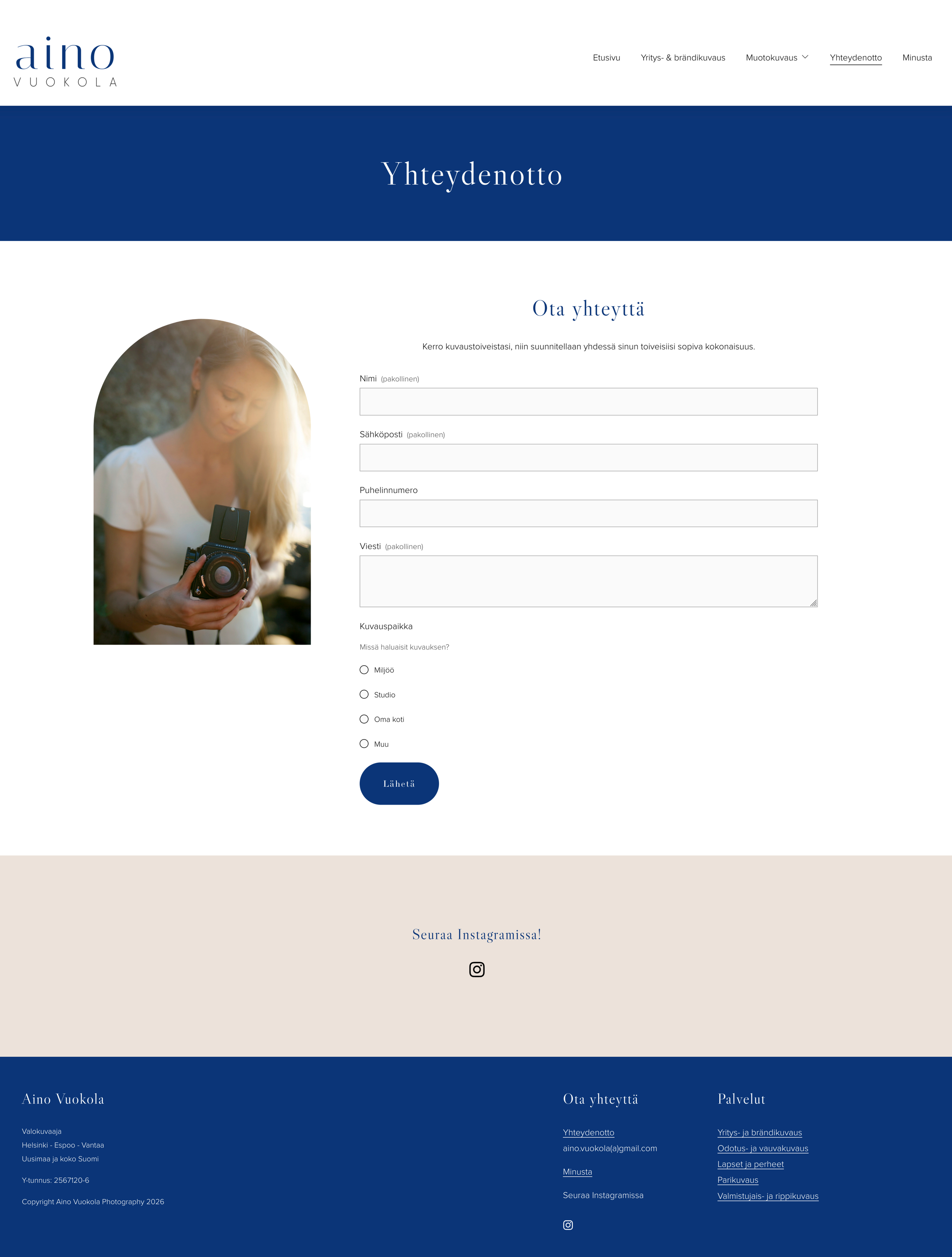
Additionally, the contact form is located at the bottom of the About page, requiring users to scroll past the photographer's biography before reaching it – creating unnecessary friction at a critical moment in the booking journey.
Homepage

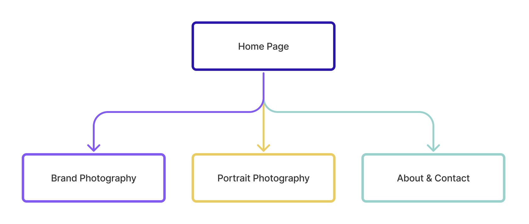
Current sitemap
The current site structure is simple, with the homepage leading to three pages: Brand Photography, Portrait Photography, and About & Contact. While business clients have a dedicated Brand Photography page, all private client subcategories share a single Portrait Photography page. The contact form is embedded within the About page rather than being easily accessible on its own.
Redesign
Based on the identified problems and user needs, the redesign focused on three key areas: restructuring the site navigation to serve each user group more directly, mapping out clear user journeys for business and private client types, and improving the content on Portrait Photography pages with practical information that supports the booking decision.
User Journeys
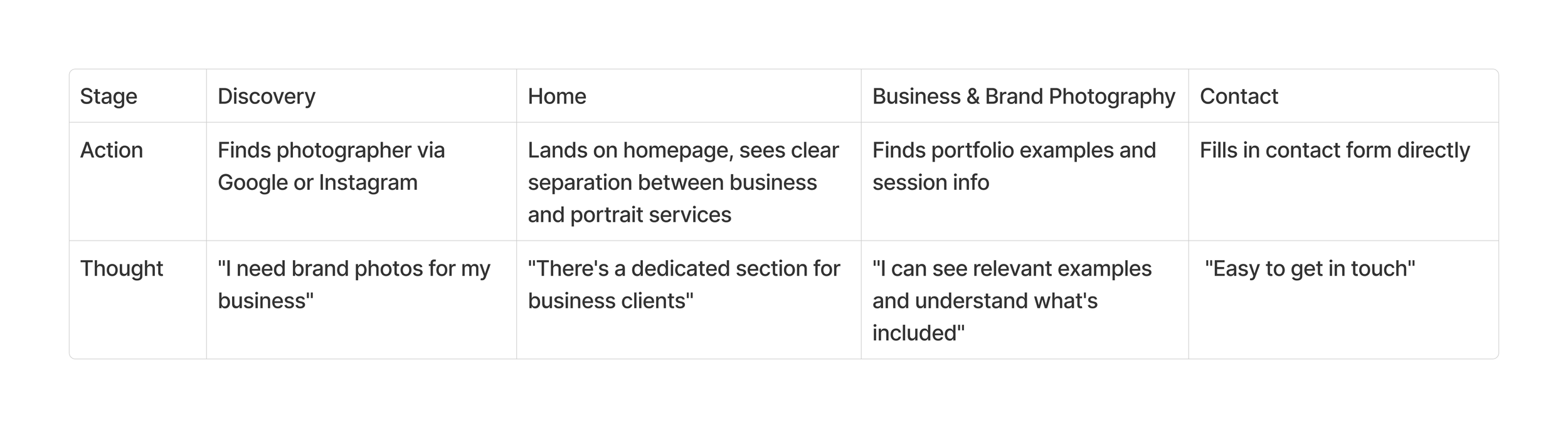
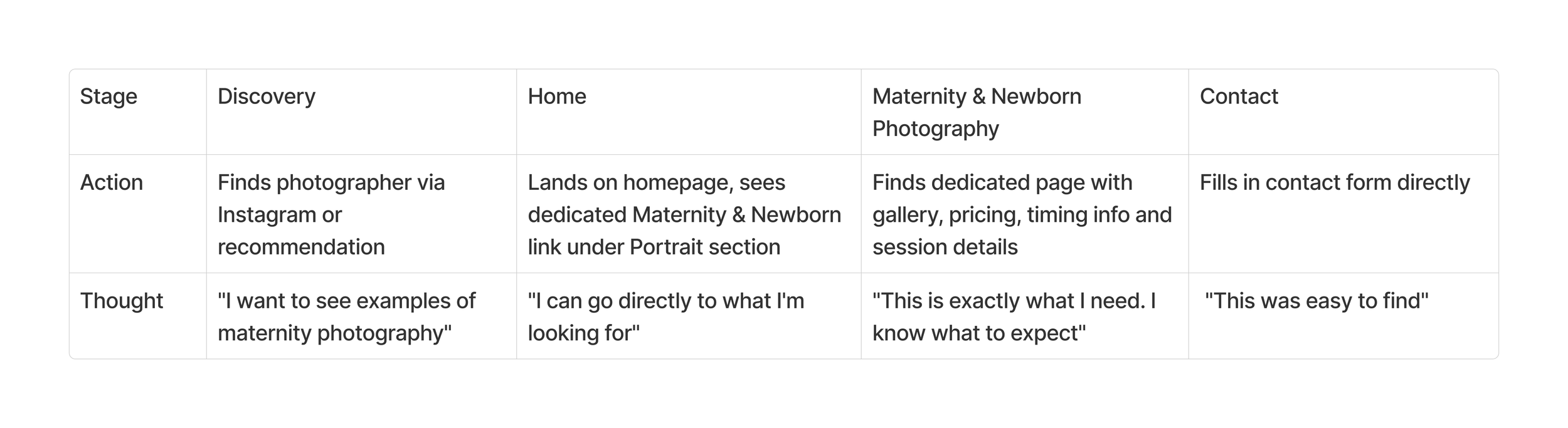
To ensure the new structure supports each user group effectively, I mapped out user journeys for the two main client types – an entrepreneur and an expecting mother. These journeys outline the steps from discovery to contact, showing how the redesigned site guides each user to relevant content with minimal friction. The entrepreneur's path leads directly to the Brand Photography page, while the expecting mother can navigate straight to the Maternity & Newborn page – each finding the information they need without having to filter through unrelated content.
Entrepreneur
Expecting Mother
Content Improvements
In addition to structural changes, the content of each service page was developed to provide clearer and more practical information for potential clients. Each portrait photography subcategory now includes:
Starting prices – giving clients a transparent overview of costs before reaching out
Session locations – a list of suitable locations per photography theme
Session duration – so clients know what to expect time-wise
What's included – a clear breakdown of what the session covers
Best timing – included on the Maternity & Newborn page to guide clients on when to book in relation to their due date
These additions reduce uncertainty and lower the threshold for getting in touch, making the booking journey smoother for all user groups.
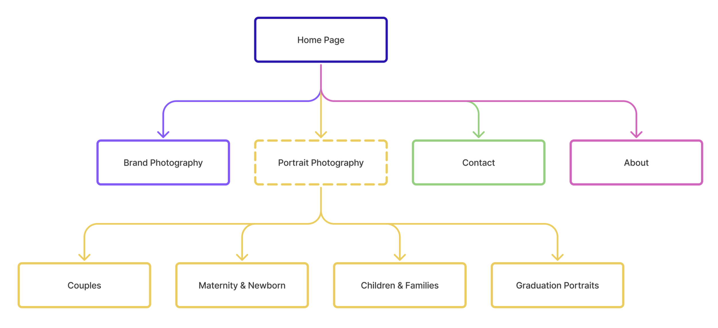
Navigation & Homepage Structure
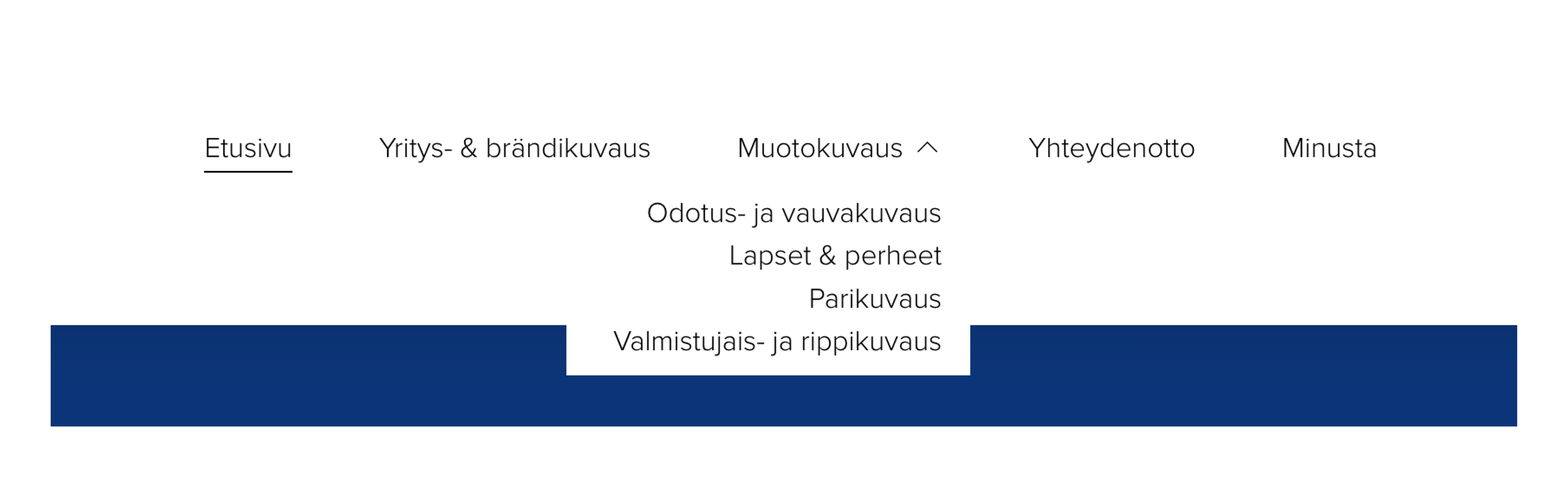
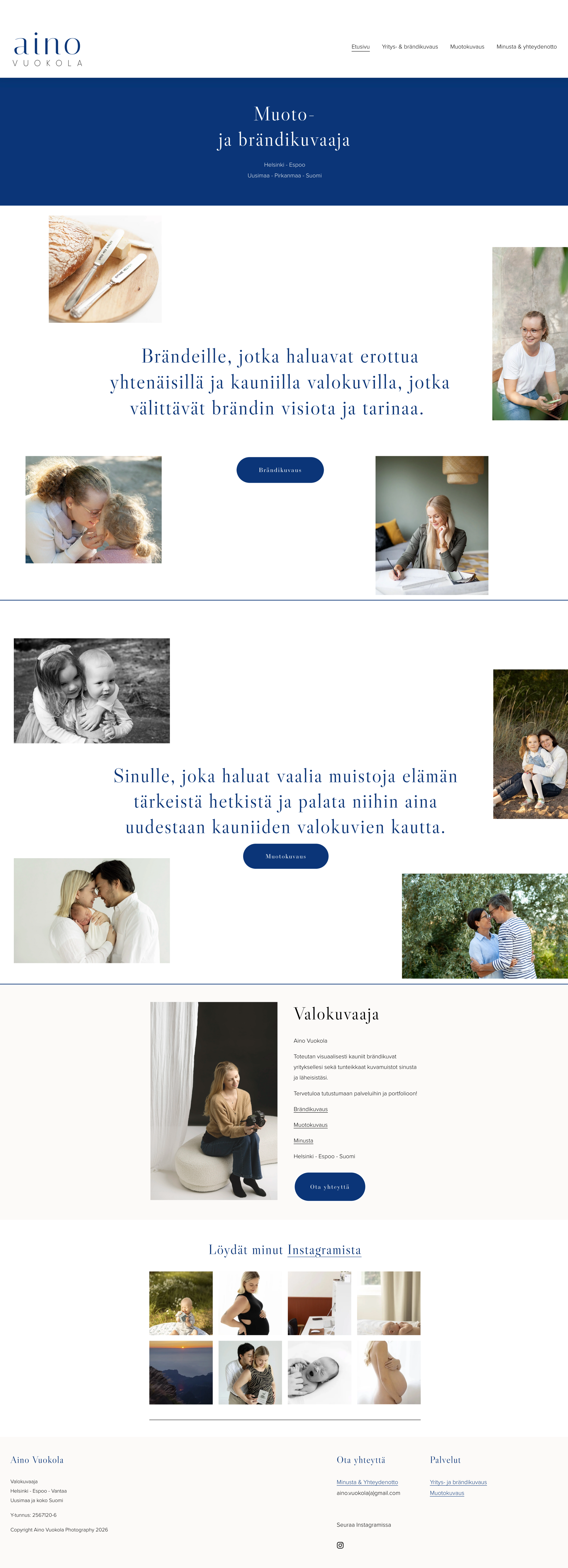
The Portrait Photography section works as a dropdown menu in the navigation, giving users direct access to each subcategory without an intermediate landing page. The same structure is reflected on the homepage, where each portrait photography category is presented as a direct link alongside the business photography section.
This means users can reach their relevant content in fewer clicks – directly from the homepage or navigation, without needing to browse through a general portrait page first.
Before & After
To illustrate the impact of the redesign, this section presents side-by-side comparisons of the original and redesigned pages. Each comparison highlights how the changes address the specific problems identified earlier – from navigation and homepage structure to individual service pages and the contact experience.
Navigation
Before: A single "Portrait Photography" link in the navigation. Contact and About combined under one page.
After: A dropdown menu with direct links to all four subcategories, allowing users to navigate to their relevant content in one click. Contact and About separated into two dedicated pages, with Contact accessible directly from the main navigation.

Homepage
Before: Business and portrait photography presented as equally weighted sections, with no direct links to portrait subcategories. Difficult to distinguish between different sections. No way to contact directly from the homepage.
After: Clear visual hierarchy with direct links to all four portrait photography subcategories alongside the business photography section. Colours used to differentiate sections on the page. Contact form added directly to the homepage.
Portrait Photography
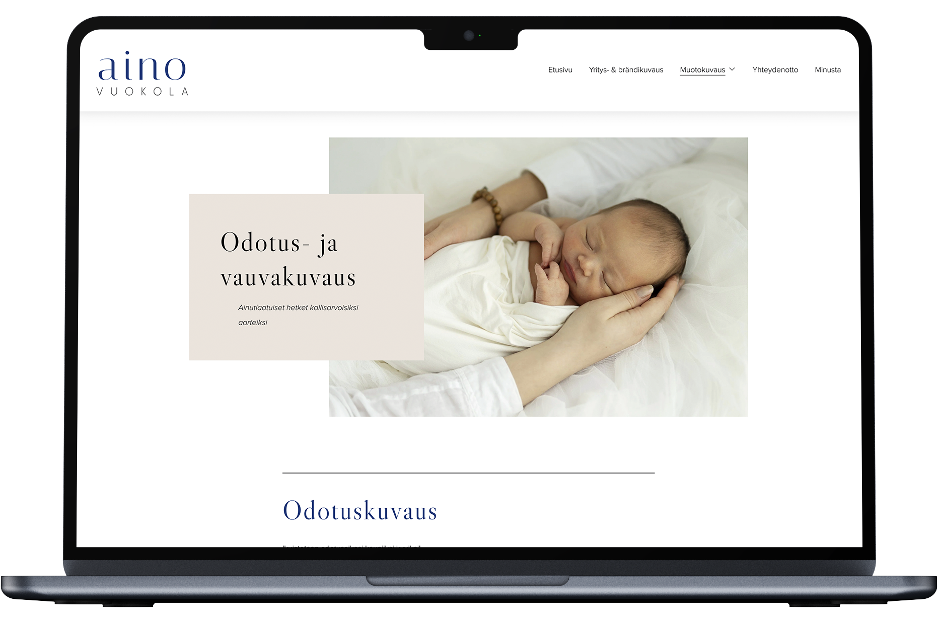
Before: A single long page displaying images from all portrait themes without clear categorisation. Cluttered infomation between image sections. Long text paragraphs with no pricing, no practical details and no visual hierarchy.
After: Four dedicated pages, one per category, each with its own gallery and relevant content. Structured content with starting prices, session locations, duration and what's included. Maternity & Newborn page includes also guidance on the best time for the session.
Contact & About Pages
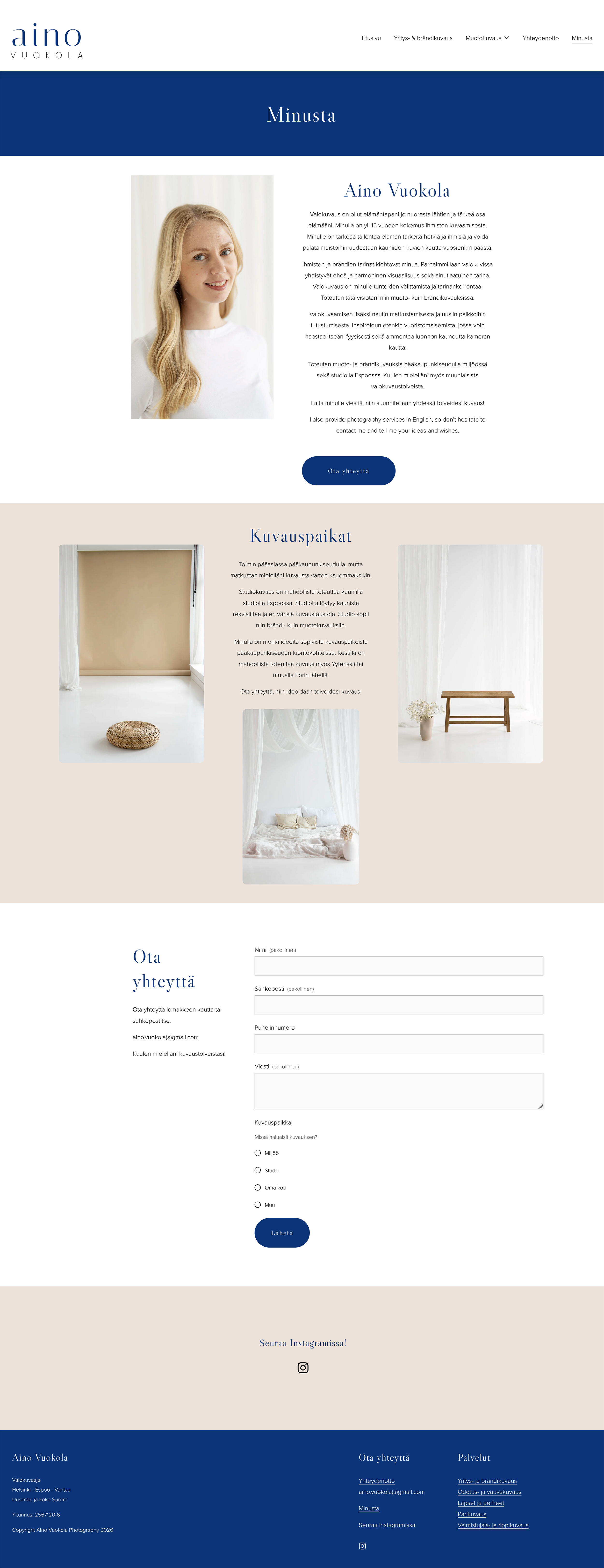
Before: Combined on a single page, with the contact form placed below the photographer's biography.
After: Separated into two dedicated pages, with Contact accessible directly from the main navigation. More content on About page to make the photographer more approachable. Also providing information about studio and session locations.
New Contact & About Pages
What Changed & Why It Matters
The redesign introduced several structural and content changes, each tied to a specific user need or usability issue identified during the analysis.
Portrait Photography page split into four dedicated subcategory pages → users can find relevant content immediately
About and Contact separated into two pages → removes friction from the booking journey
Contact form accessible directly from the main navigation → reduces steps to conversion
Homepage hierarchy clarified → business and private clients are directed to relevant content faster
Brand colours used more intentionally to distinguish sections → helps users visually separate different service areas at a glance
All changes implemented and optimised for both desktop and mobile → ensures a consistent experience across devices
Alt texts added to images → improves accessibility and search engine visibility
Impact
These changes result in more focused content, clearer information, and a smoother path to booking for every visitor.
For the user, dedicated pages for each portrait category create a more personalised experience – an expecting mother, a family, a couple or a graduate each lands on a page that speaks directly to them, with imagery and information tailored to their specific needs. Transparent pricing and practical session details make it easier to evaluate the service and decide to reach out. Separating the Contact page from About removes unnecessary friction at the most critical moment in the booking journey.
For the business, a clearer site structure and more informative service pages reduce the need for back-and-forth communication before booking – clients arrive better informed and with more realistic expectations. Dedicated category pages also make it easier to attract the right clients for each service, improving the overall quality of enquiries.
What I learned
Learned to use FigJam as a documentation and design process tool
Learned to work efficiently with AI using Claude for structuring, ideation and content development throughout a design project
Gained a deeper understanding of how to identify and address the needs of different user groups in UX design
Learned that content clarity is as important as information architecture – transparent and well-organised service information plays a key role in converting visitors into clients