UX/UI design for a Finance Application
Personal Project
Fintellect – Personal Finance App Prototype
This was my personal design project, where I created a prototype for a finance application called Fintellect. The app is designed to combine all of the user’s financial information in one place, offering a comprehensive, clear and user-friendly overview of their personal finances.
Design Focus
For this project, I aimed to combine both UX and UI design to deepen my understanding of designing solutions based on real user needs. The project followed a four-phase design process: Discover, Define, Develop and Deliver.
Understanding users' expectations was essential before planning the app’s features. The Discovery phase provided a strong foundation for ideation. After defining user personas and framing the core concept of the app, I moved into the Development phase, where I designed the application prototype.
I applied agile methods during the development and testing phases, enabling fast iterations and continuous improvements based on user feedback.
Project Goals
My main goal for this project were to design a visually appealing and easy-to-use application, which includes a broad overview of the user’s financial information.
In addition, I wanted the app to encourage users to save and invest, helping them improve their financial stability over time.
Final Solution
This was a broad and challenging project for one person, requiring me to manage many different aspects of the design process.
Throughout the project, I learned how to stay focused on the details while keeping the bigger picture in mind. I'm proud of both the journey and the final result.
Tools used
Miro for process planning, ideation and taking notes during testing and development.
Microsoft Forms for creating and conducting user surveys.
Canva for creating personas.
Figma for wireframing, prototyping and building the user interface.
Project was divided into four main phases: Discover, Define, Develop and Deliver. The discovery phase focused on background research including user surveys and benchmarking. During the define phase I translated research insights into personas, use cases and problem statements and conducted ideation to develop the main concept. In the development phase I created sitemap, task flows, wireframes and style guide before designing the interactive prototype. The final phase was about finalizing the prototype based on user testing feedback.

Project Timeline
Discovery Phase
During the discovery phase, I conducted user reasearch to better understand potential users and their behaviors regarding financial apps . I also performed benchmarking which provided insights into features, functionalities, and UI design of existing financial applications.
Surveys
In the first survey, I explored users’ needs and usage habits related to financial applications. The second survey focused more deeply on specific areas — budgeting, investing and saving. It also uncovered users’ more detailed preferences for tracking their money.
Key Findings
75% of users had tracked their finances using a financial application for over a year and would be interested in using an app that gathered all their financial information in one place.
The most important aspects users wanted to track were: Income and expenses, savings and investments.
Users expressed a desire for more expense categories and a more visually appealing user interfaces
40% of users considered budgeting important and reported using Monefy or Excel to manage both annual and periodic budgets.
60% of users preferred to manually enter their income and expenses and wanted detailed categories to choose from.
60% were also interested in creating and managing saving plans through the app.
Benchmarking
Benchmarking included a comparison of four applications: Nordea, Nordnet, S-Pankki and Monefy. Main aspects I investigetied were:
Contents of the applicaton
How tracking of income, expenses and investments were presented
How expenses were categorized
Overall UI design, including the use of icons, graphics and visual elements used to illustrate income, expenses and progress tracking
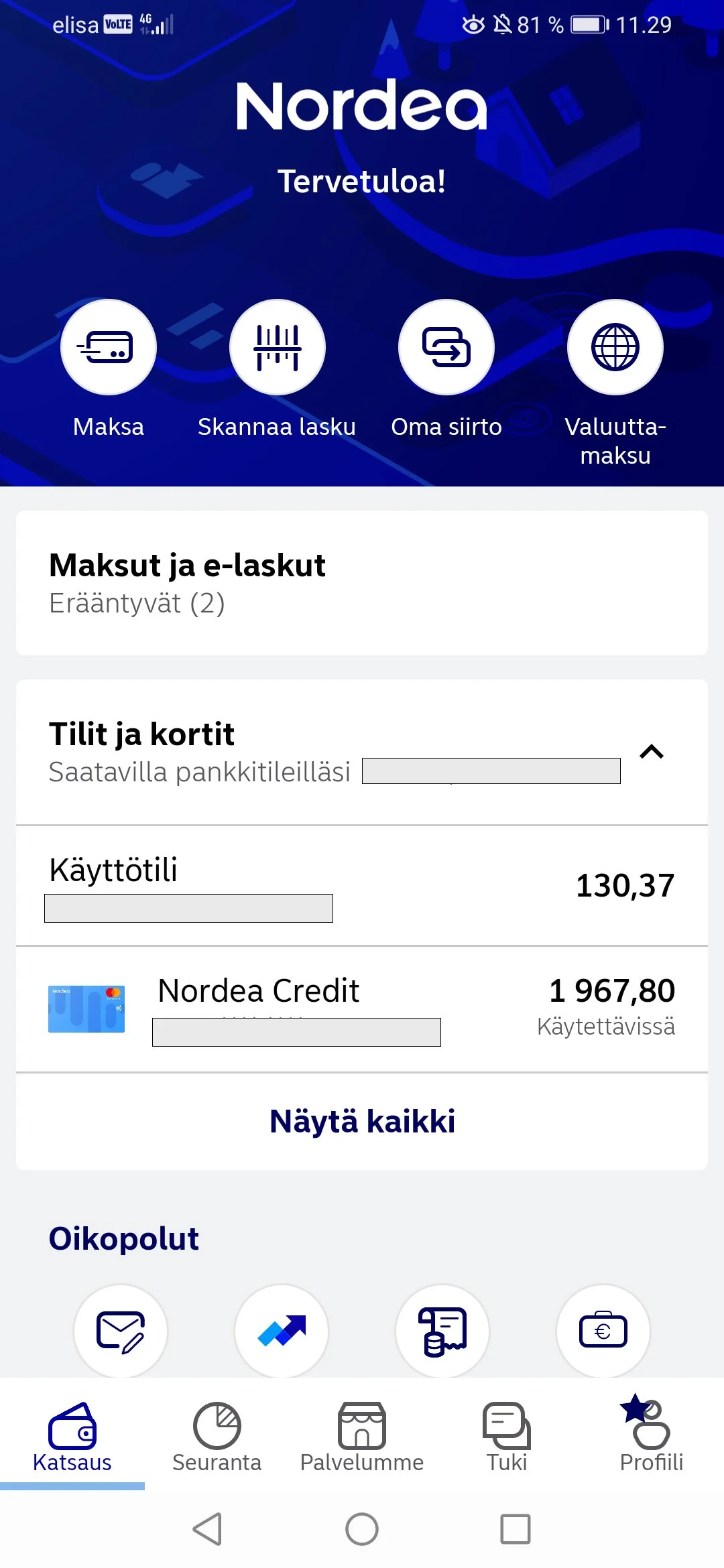

Nordea
Expense tracking is presented using percentages across different spending categories
Expense categories are illustrated with icons
The progression of mortgage payments is visually represented as a circular progress indicator around a house icon

Nordnet
Provides detailed information about dividends
Holdings are presented clearly as total sums, percentages and visual graphics
Investment progression is illustrated through a visual graph, making it easy to track performance over time
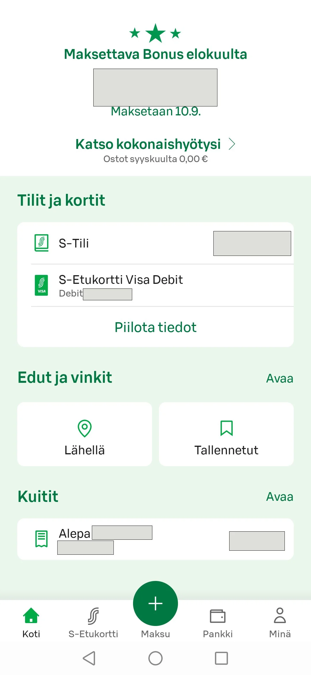

S-Pankki
Upcoming bonuses are displayed on the homepage as a large number
Purchases are categorized by both time and content
Large icons are used to represent different spending categories
Expenses are illustrated as circles of varying sizes
Price comparison feature between different shops
Application engourages saving

Monefy
Clear comparison between income and expenses
Possibility to manually add income and expenses
Big buttons on the homepage to add income or expenses
Different categories presented with colorful icons

Define Phase
In the define phase I created personas, use cases and problem statements based on findings on discovery phase. I also ideated the main contents and features of the application on idea wall.
Use Cases
As an employee, I want to budget my finances so that I can track whether my income is sufficient for my needs.
As an investor, I want to quickly see how my investments are performing, so I can make informed decisions for the future and grow my wealth.
As a parent, I want to stay on top of my financial situation so I can trust that it’s on solid ground and plan the future.
Problem Statement
Persona 1 is a high-earning and busy investor and budgeter who needs an efficient financial tracking app to stay on top of her investment performance and to support long-term financial stability through effective budgeting.

Use cases
As an employee, I want to track my spending, so I can make better-informed purchasing decisions.
As a budget-conscious person, I want to see my current financial status in real time, so I can stick to my savings plan and secure my future.
As an employee, I want to track my financial situation actively and easily, so I can make smart financial decisions both now and in the future.
Problem Statement
Persona 2 is a budget-conscious and careful spender who needs an app to track income and expenses, as it helps her influence her spending habits, stick to her savings plan and secure her financial future.
Idea Wall

Development Phase
The development phase began with planning the application structure by creating a sitemap. Task flows were designed to outline the main tasks to be implemented. Wireframes of different screens were created to roughly visualize the page layouts and content. The first usability testing was conducted using the wireframes to ensure smooth navigation throug the app.
The first version of prototype was developed by adding more content and pages and enhancing the user interface with color and animations. The overall visual style was established by creating a style guide. Finally, the prototype was tested and changes were made based on the testing results.
Sitemap
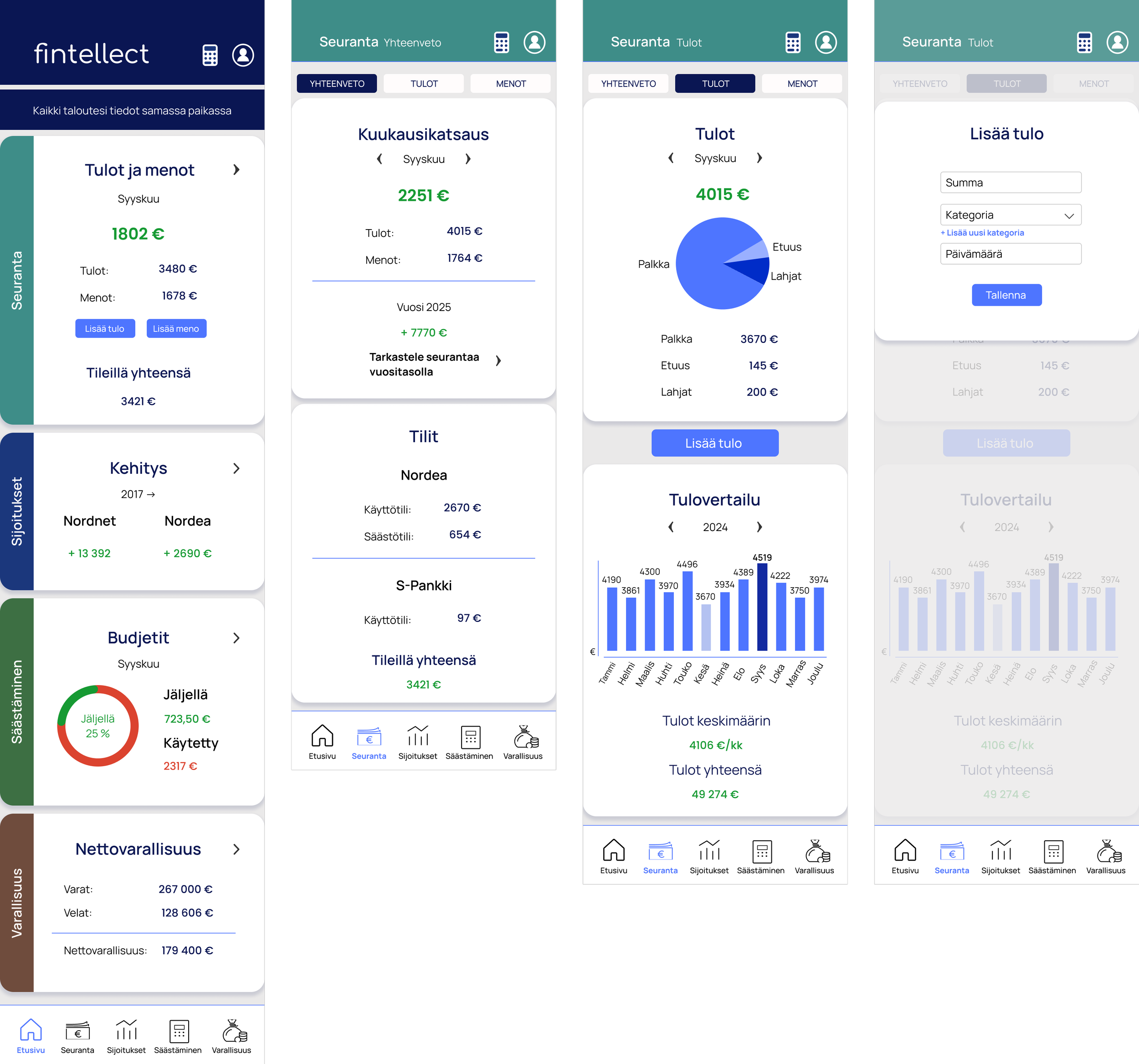
The structure of the application consists of four main pages: Tracking of income and expenses, investments, budgets and savings and assets and liabilities. Homepage provides a brief overview of the main financial information. The application also includes a profile page with settings.

Task Flows
Four different task flows were created to structure the main processes to be completed in the prototype.
The first task flow focused on adding an expense in the app.
The second task flow involved a simple process to check dividends.
The third flow covered creating a saving plan.
The final task flow was logging out from the application, which was designed to happen from the profile page.

Wireframes
I began the development process of the prototype by creating wireframes for the different pages of the application. The wireframes included login flow with four pages. The homepage and the four main pages were designed to showcase the core features of the application. The process of adding an expense was built using several connected pages to illustrate the full user flow. The final page in the wireframe set was the profile page.
A bottom navigation bar was included in the layout to allow easy access to key sections. I also added the main task flows to the buttons to prepare for the first round of usability testing.
The application was named Fintellect.


Wireframe Testing & Insights
Wireframe usability testing revealed the following insights:
In the first attempts, user tried to navigate to the Expenses page from the homepage by clicking the text "Menot” (Expenses). However, on the Tracking (Seuranta) page, user was able to find and access expenses easily.
The Add Expense feature was easy to find and use.
Both Dividends and Net Worth were located without difficulty.
Logging out was easily accessed via the Profile page.
User had difficulty finding saving plans. Initially, they clicked all other buttons on the bottom navigation bar. Eventually, saving plans were discovered through the Budgets section.
The terms "Säästösuunnitelma" (Saving Plan) and "Budjetit" (Budgets) seemed to cause confusion.
The difference between "Varallisuus" (Wealth) and "Sijoitukset" (Investments) was also unclear.
Changes to be made:
Improve link visibility on the homepage to clearly direct users to different sections.
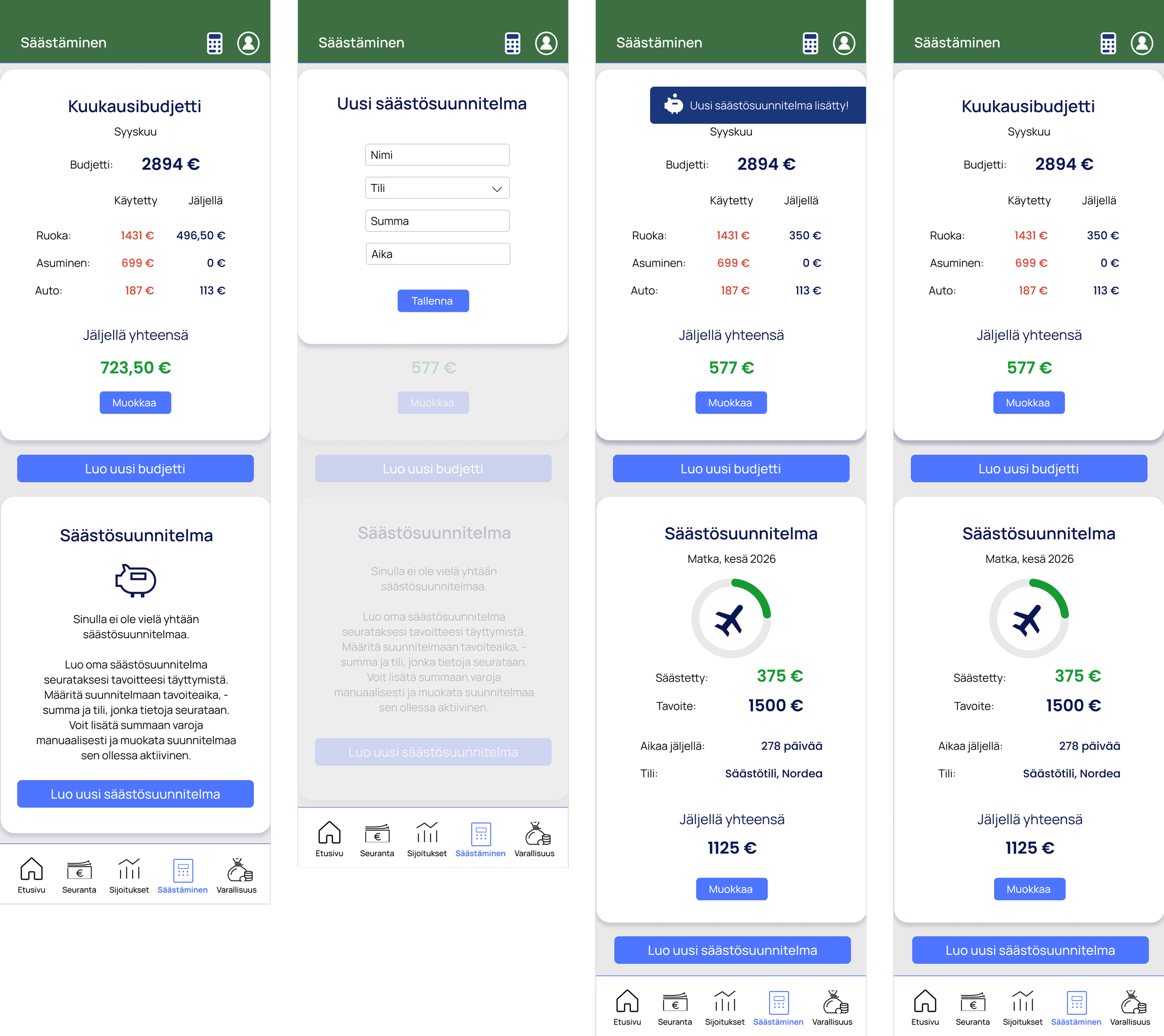
Rename "Budjetit" (Budgets) to "Säästäminen" (Saving) both on the bottom navigation bar and on the Budgets page.
Clarify the budgeting section to make its purpose and functionality more intuitive.
Improve understanding of saving plans by adding an informative description or instructions on the Savings page.
Consider clarifying the difference between Wealth and Investments.
Style Guide
A simple style guide was created to present the main color and typography styles used in the application interface. It included the application logo, typography styles for headings, body text, button lables and navigation icon texts. The guide also defined color selections for different text elements and backgrounds.
Additional section-specific colors were introduced at a later stage, as usability testing revealed the need to visually distinguish between different sections more clearly.


Prototype
The first version of the prototype was built based on the wireframes and the insights gained from wireframe testing. To make the prototype feel more realistic and visually engaging, I added the logo and defined the color scheme. Detailed content was also added, including graphics that visualize income and expenses.
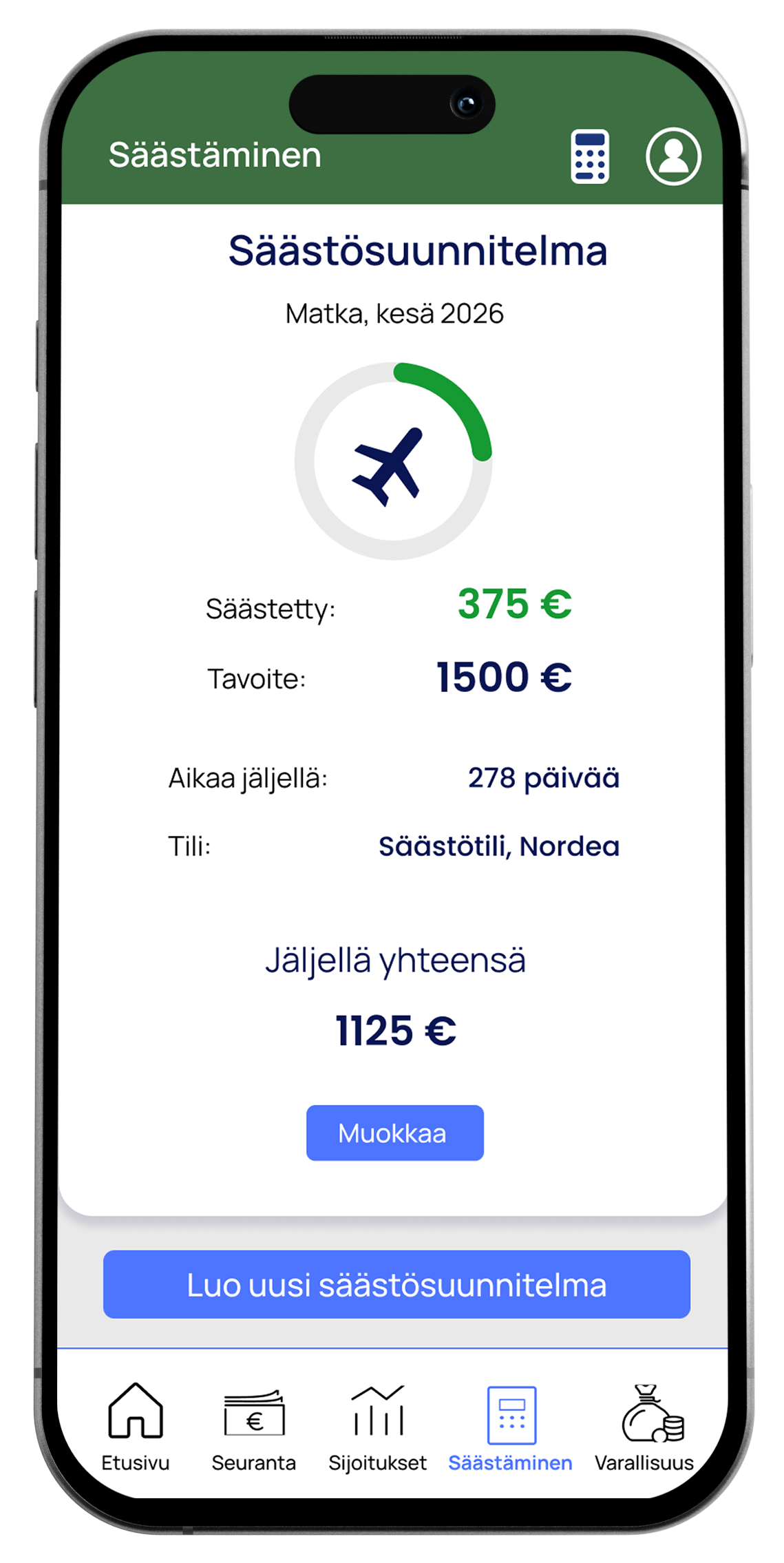
Some functional changes were made during this stage — for example, the original "Add Expense" flow was replaced with an "Add Income" flow. Additionally, I designed a two-screen flow for creating a Saving Plan.


Navigation Bar
To ensure clarity and ease of use, I designed the navigation bar using both icons and labels. This combination helps users quickly recognize and understand each navigation option, improving overall usability.

Direct Links to Add Income and Expenses
Based on user survey results, many users preferred to manually add income and expenses within the app. Therefore, I added direct links to these actions in the Tracking section on the homepage. This allows users to quickly access the income and expense input screens without navigating through multiple pages, making the app more efficient for daily tracking. Additionally, wireframe testing revealed that users had difficulty finding the Expenses page from the homepage. To solve this, I included both clear action links and a right-hand arrow icon within the Tracking section to improve navigation.

Links to Different Sections
I wanted to create clear links to different pages on the tracking page and place the links on top of the page.

Tracking Both on Monthly and Yearly Basis
As the users expressed the need to track their income and expenses on both a monthly and yearly basis, I added the option to switch between monthly and annual tracking within the Tracking pages. To maintain a clean interface, I placed a text link to the Annual Tracking view just below the Monthly Tracking section, rather than displaying both sets of information on the same page.


Different Income Categories
The user survey revealed that the users want to choose different categories for expenses and be able to create their own categories. With this in mind, I created a selection of default categories when adding an income and also possibility to add custom categories if needed.


Compound Interest and Net Worth calculators
One of my goals was to inspire users to save and invest more actively. To support this, I included easy-to-use compound interest and Net Worth calculators directly in the app. These tools allow users to plan their investments and track their financial progress without needing to search for external calculators. Personally, I find it highly valuable to have these features built into one app, making financial planning more convenient and motivating.

Prototype Testing and Insights
Prototype testing showed that the overall usability of the app was good and clear. Users found the content in different sections clear and informative. While the visuals were considered clear, some users felt they were too simple and expressed a desire for more colors, images and icons to make the interface more engaging.
The calculators were regarded as interesting and unique features, with a user suggesting they be made more visible and accessible from all pages within the app. However, some users found the Net Worth calculator less relevant to their individual needs.
Delivery Phase
The final version of the prototype was created by making the changes based on prototype testing in the development phase.
Key changes included:
The app’s main color was changed to a darker blue to give it a more professional appearance.
Each section was assigned its own distinct color to help users easily differentiate between them. These colors were applied to the homepage sections as well as the top navigation panel on each section page. Additionally, section titles were added to the homepage sections.
Graphics were created to add personality to the interface. For example, the budget progress on the homepage is now visualized as a circular progress graph. The saving plan section features a piggy bank icon and the savin progress is demostrated as a progress graph with a saving theme icon.
Animations were added to make the prototype feel more dynamic and engaging. After saving an income entry, a notification appears briefly confirming the action. Similarly, when a saving plan is created, a pop-up text bar appears on the screen.
A calculator icon was added to the top navigation bar, allowing users to access calculators from any page. This icon links to the calculator page, which includes the standard calculator as well as options for the Compound Interest and Net Worth calculators.


What I learned
Plan a project efficiently and maintain a steady progress based on the plan
Conduct a comprehensive background research before development and to ideate the main features based on user needs
To use an iterative approach during the development phase
To use Figma more efficiently when designing wireframes and prototype
Use animations in prototyping in Figma
Use Figma Mirror to preview and test the prototype design in real time on mobile devices